Mammoth Mountain
Design | Art Direction | UX | Motion | E-Comm | Front-end Hand-off
The Project
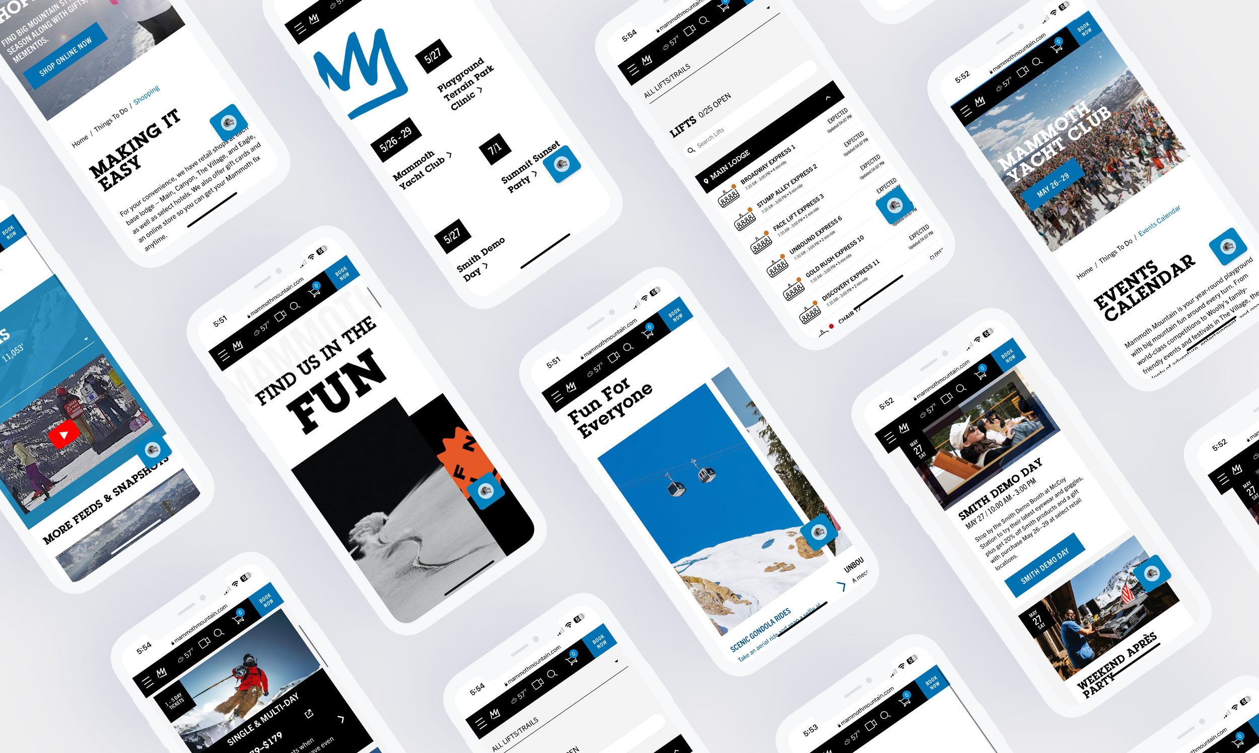
The revamping of the Mammoth Mountain website was a substantial collaborative effort involving multiple agencies and client partners, all working together to bring the entire product to life. Our team played a crucial role in enhancing the user experience, which encompassed various aspects ranging from the site map to individual funnels. Moreover, we successfully transitioned the website to React and developed a customized Material design system, representing a significant milestone for both our client and agency partners.
Alongside these achievements, we closely collaborated with the client's brand team to ensure a harmonized visual design for Mammoth's new Material-based system. This involved merging elements from the old and new designs to create an AA-compliant site. To facilitate future referencing, we provided detailed annotations that will serve as valuable resources.
Overall, our collaborative efforts resulted in a revamped Mammoth Mountain website that delivers an improved user experience, aligns with the latest design standards, and meets accessibility requirements.
The Process
After conducting client workshops and planning sessions, we engaged stakeholders in a collaborative process to gather qualitative and review historical quantitative data. This valuable information guided our approach to revamp the website, focusing on addressing client and user-defined top-level areas of interest. These areas included navigation, the top-level navigation bar, homepage, events, and more.
Working closely with our client partners and research team, we meticulously reviewed and restructured these pages to achieve business objectives while catering to user needs and feedback while taking into account hot spot analytics. Our primary goals were to enhance overall site navigation, optimize expected usage patterns, and accommodate the significant growth since the site's initial creation.
From a technical standpoint, we dedicated significant time to refining the website's new component library for a seamless user experience. By doing so, we addressed various edge cases by creating a comprehensive library of modular elements, providing a versatile solution. Part of this process was applying global design rules in alignment with development to be applied across the site while training content editors and limiting interactions to ensure cohesiveness and reduce the chance of user error. During this time we emphasized planning for mobile component interactions, as we recognized the opportunity for substantial improvement compared to the previous version that heavily relied on adapting a desktop-first experience.
As we tackled the user experience, significant work was also being done by our team to align the visual development of the site with Mammoth’s visual standards, as well as our new user experience direction. The culmination of which was a trimmed-down and lighter design than previously seen on the site which utilized action areas highlighted with the brand blue as an indicator and brand moment. While giving plenty of room to create an extremely accessible site with improvements being made from previous iterations as we maintained a watch on the approaching release of WCAG 2.2.
In concluding the user experience and visual development portion of the project, our team also oversaw development implementation during the build phase acting as liaisons to troubleshoot and assist in the roll-out of the end product site in time for the 2022 season pass sales period.


